Contemporary architects
Juan Navarro Baldeweg – Un objeto es una sección
I believe the best definition of architecture comes from section drawings. Sections show the building spatial conception, its articulation on the vertical axis, its horizontal layering and the multiple heights spaces; they shows segregation or conversely the unitary functional organization within the building. A section presents the whole building body, its materiality, mass and voids, that is the spatial weaving of different areas or inner spaces. When one enters a building, one shall understand its structure at a glance. This intention is clearly expressed by its sectioned organism.
The section is the best graphic tool to explain the articulation of the structure and its relationship to the other construction elements such as interior or exterior openings; it is also important to disclose the syntax of the building materials throughout.
Few years ago I wrote “An object is a section”, extract from Juan Navarro Baldeweg, La habitación vacante, Editorial Pre-textos, Valencia, 1999:
“An object is a section, it is a defined portion of an open space which has spatial coordinates. To imagine an object as a section within the undifferentiated mass of material strata makes it hard to conventionally differentiate between the context and its own inherent structure or to associate shapes and boundaries, instead it reinforces the notion of essential diversity. The elements of an architectural object follow construction rules, geometric and figurative impulses that are autonomous and totally independent in accordance with this diverse and differentiated materiality. We can properly call elements, elements of the project, those particular portions extracted from the continuity of unlimited strata. As in the accumulative universe of Brancusi or Hiroshige’s graphic multiplicity, the elements will freely coexist, independent.”
Read text
Biblioteca Hertziana
Roma (I), 1995-2012
The place, which was the former terrace garden of Lucullo’s roman villa, was generated by the terraced disposition of the retaining walls, along the southern slope of the Pincio hill. The formal suggestions of that garden inspired our project, mostly for this unitary vision of a terraced space.
We propose that the public access to the library be by the portale mascherone, which Zuccari intended as the right contrast to the paradisiac enchantment of what could be seen overstepping its doors. Even in our case, from that entrance one can suddenly understand the whole space conception of the library. Now the place is transformed into a light well with a glass perimeter and a walled background, slightly sloping, on which light bumps and is reflected. Around this central void gather the terraced floors, featuring a free shape and hosting he bookshelves and the reading rooms.
In this way, the interior space results as very interesting even being a small one, thanks to his vertical rhytm, to the natural light and to the formal richness of a terraced disposition around a trapezoidal courtyard.
Nuevo Edificio de Juzgados
Mahón (E) 2007-2012
The new building is formed by two different layers, as the one we built aside in 1996. The base is a dry stone wall, in reddish and golden shades; it exhibits its continuity with the terraced terrains in the surroundings and, most of all, it refers to the typical rural buildings with small walls and terraces scattered all over the island. The superior layer gives an image of high contrast with the base. In the existing courthouse this part is plastered and painted in pure white, and shines in the sunlight. For the new building, we propose an hollow wall made by two layers of glass. The separation between the two layers will permit to clean and mantain the internal cavity.
The matte finishing of the external glass will appear to be a very white surface too. Nevertheless, this double facade is not matte: it’s translucent, and some areas are completely transparent – we could call them windows and create views on the exteriors. Therefore, light can enter through the whole envelope and views are allowed for some rooms. It’s easy to realize that the proposed solution, even using nowadays technologies and materials, is very similar to previous one, in which the same effect was obtained with large aluminium brise-soleils.
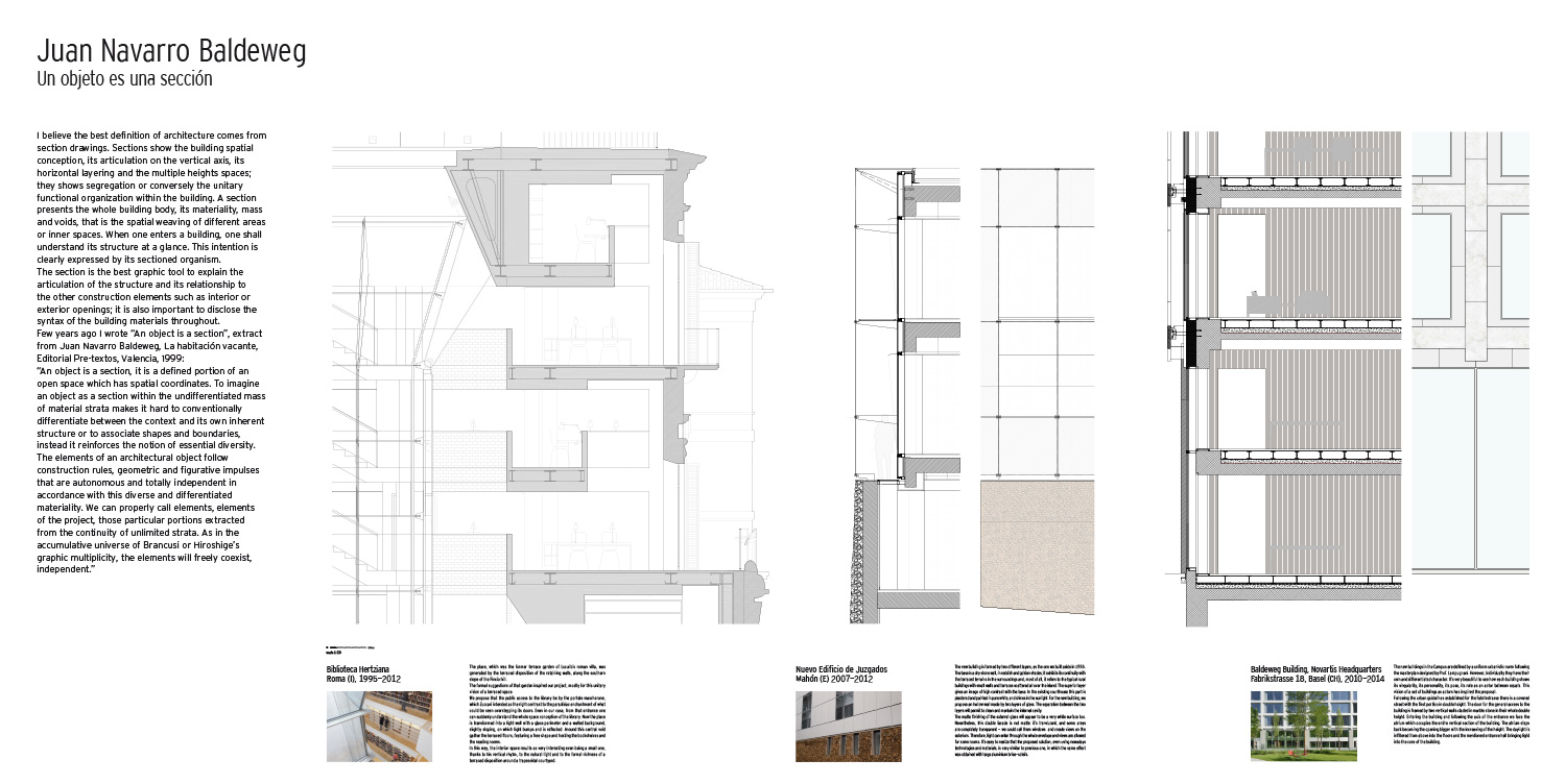
Baldeweg Building, Novartis Headquarters
Fabrikstrasse 18, Basel (CH), 2010-2014
The new buildings in the Campus are defined by a uniform urbanistic norm following the masterplan designed by Prof. Lampugnani. However, individually they have their own and differentiated character. It’s very beautiful to see how each building shows its singularity, its personality, its pose, its role as an actor between equals. This vision of a set of buildings as actors has inspired the proposal. Following the urban guidelines established for the Fabrikstrasse there is a covered street with the first portico in double height. The door for the general access to the building is framed by two vertical walls claded in marble stone in their whole double height. Entering the building and following the axis of the entrance we face the atrium which occupies the entire vertical section of the building. The atrium steps mback becoming the opening bigger with the increasing of the height. The daylight is infiltered from above into the floors and the mentioned entrance hall bringing light into the core of the building.